
Case Bound Book Week – Tuesday
January 26th, 2010 | Link
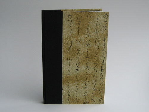
Book number two is covered with an old favorit a calligraphic script, also from The Paper Place. I’ve used this a number of times for photo albums and I like its elegance. It’s a pretty good “Man Paper” (because my boss sometimes chides me for having too many flowery papers).
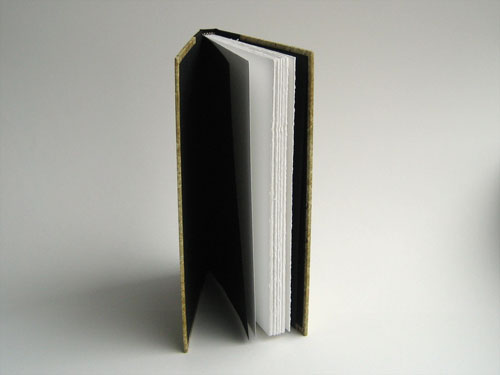
The book is 5-1/2″ wide and 8-1/2″ high and about 5/8″ thick, with six sections of Mohawk Superfine 100lb paper (4 folios per section) for a total of 96 pages.


I’ve used that same paper for journals before and like you, I realized that it’s a “man paper”. In general, I don’t consider myself girly but apparently most of my paper choices are.
Elissa, we both have a fondness for Chiyogami papers and I think they naturally tend towards florals–and face it, who buys photo albums or journals? In my experience it’s usually women, or if men, then for the women in their lives. When men buy journals they want leather, or solid book cloth or paper with a natural texture, or maybe a geometric print. I like geometrics myself, but they’re not the ones that jump out at me when I browse the Paper Place web site.