
Alphabet Book
June 11th, 2008 | Link
Because I haven’t been busy enough lately, I decided to take a graphic design course this summer through UC Berkeley’s extension program. I’ve actually been wanting to do this for several years, but my last company didn’t have a tuition reimbursement program, and my current employer does. Yay!
Our first assignment was an alphabet book (really a scrapbook, though I somehow glossed over that part in my head when I was thinking about the assignment), in which we were supposed to work with images that visually resonated with us. In my case, I decided that the things that resonate with me are (1) book structures (duh), (2) typography, (3) paper, especially the Japanese papers, and (4) the color red.
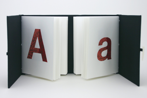
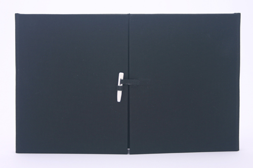
I decided on a gatefold book structure because I thought it would be cool to have the upper and lower case letters facing each other in their own book. Each letter is cut from a different Chiyogami/Yuzen paper, with the upper- and lower-cases matching. As a bonus, if you’re kinda geeky, you can create the entire periodic table of the elements: Fe, He, etc. The typeface is Helvetica Neue Bold, chosen mainly for its uniformly wide strokes which were easy to glue, and also because I figured I would have lost a finger for sure if I had to cut serifs with an Exacto knife!
The paper is Mohawk Superfine 100lb text. Each side is a single section of 13 sheets, pamphlet-sewn into the spine. My measurement for the front and back cover boards did not take into account the hinging and additional width of the spine piece (since I sewed the sections into 5/16" wide spine boards with 1/4″ for the hinges), and as a consequence the sections are slightly too far apart: I would have preferred them to be almost flush. But on the whole I like the way it turned out.
(I dropped the color red from the mix. I have a stunning silk-like red book cloth that I almost covered the book with, but I decided it would detract from the Japanese papers, and I went with black instead. It was a smart decision.)


This is genius! I love it!
Thanks!